Storm Animations, CACTI-Style
Published: 21 September 2020
New visualizations turn data into dramatic 3-dimensional images of evolving thunderstorms

For scientists, papers and presentations require visualizing data. Typically, that means bar graphs, dual-axis charts, and other two-dimensional (2D) representations.
In a digital age, such visualizations are getting more dynamic.
In the summer of 2020, computational scientists at Pacific Northwest National Laboratory (PNNL) in Washington state, with the help of a 10-week intern, continued their experiments with three-dimensional (3D) animations of evolving convective clouds.
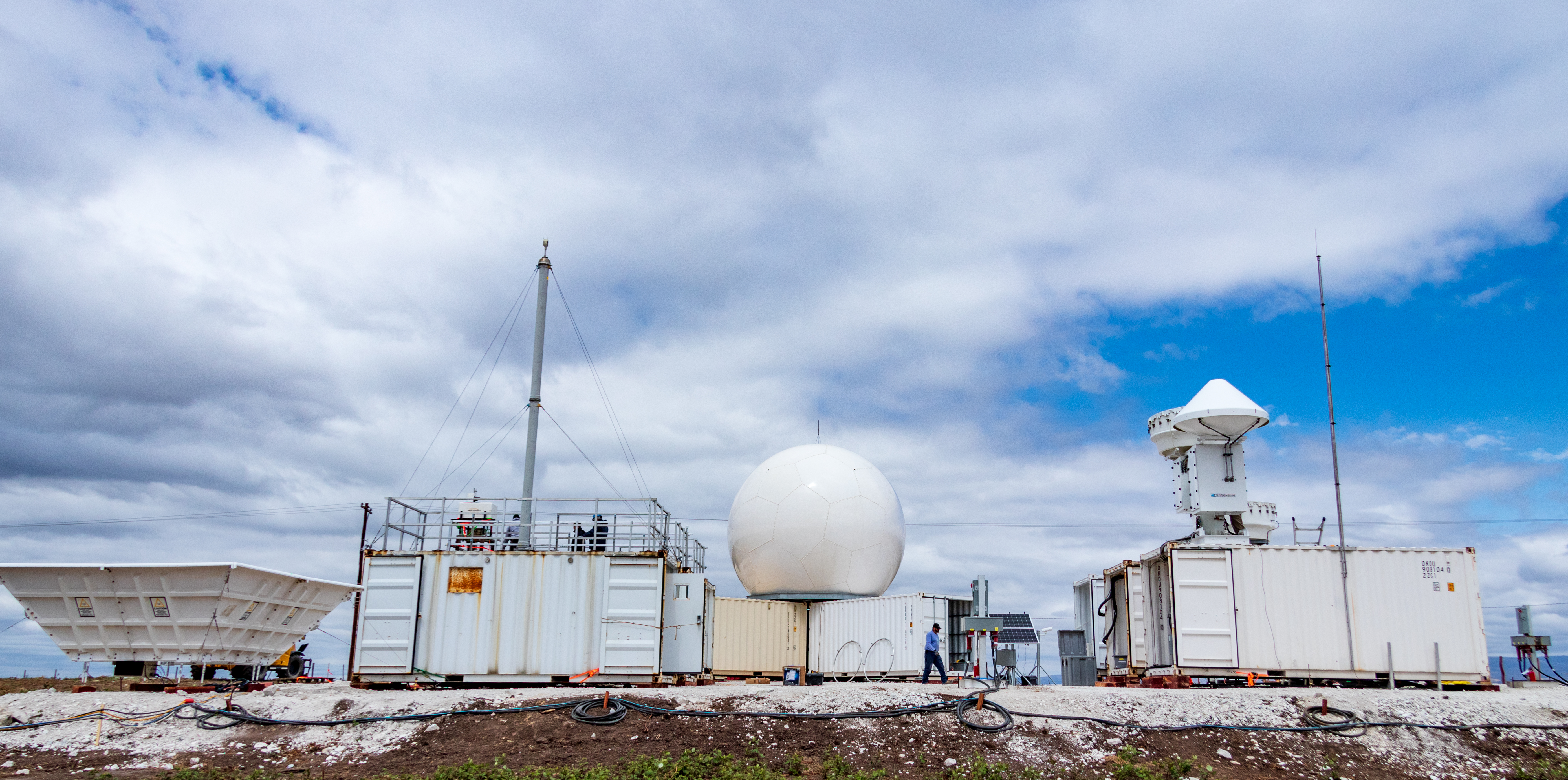
The data were captured by precipitation radar during the 2018–2019 Cloud, Aerosol, and Complex Terrain Interactions (CACTI) field campaign, managed by the U.S. Department of Energy’s (DOE) Atmospheric Radiation Measurement (ARM) user facility. The campaign’s main observatory was in a mountainous region of Argentina reputed to spawn the largest and tallest thunderstorms in the world.
More broadly, the 3D work at PNNL is just one facet of ongoing research for the Integrated Cloud, Land-Surface, and Aerosol System Study (ICLASS) Scientific Focus Area project, sponsored by DOE’s Atmospheric System Research program.
A Wider Appeal
Over CACTI’s seven months, scientists gathered terabytes of unprecedented measurements on the anatomy of thunderstorms, with 200 scientists from seven countries taking part. CACTI also featured the first deployment of the second-generation C-Band Scanning ARM Precipitation Radar (CSAPR2), which delivers slice-like flat images of the atmosphere.
Those slices are real-time profiles of updrafts and other storm-building factors. They were the grist for the recent visualizations, which transformed flat 2D files into spiky and colorful 3D peaks that progress over terrain. On display is how clouds evolve into a storm.
The visualizations are not the first of their kind, says PNNL computational scientist Joseph Hardin, who oversaw the project. “We’ve been using 3D visualizations since we’ve had computers,” including for models and for one-time personal research projects. “A lot of us have played with this, though have not tried to make it look nice.”
He adds that “not a ton of 3D visualization has been used in radar research settings―for ARM data in particular.”
Three animations put unique CACTI case-study data on display, says Hardin. “They are something scientists can use, but appeal to a broader audience too.”
‘Cool Way to Tell the Story’
The 3D animations of CACTI storm-evolution data were done by Lilianne Callahan, a rising senior and physics major at the University of California, Santa Cruz. In late August, she finished a 10-week stint at PNNL as part of DOE’s Science Undergraduate Laboratory Internships (SULI) program.
“Until you learn how to do it, it’s definitely a slow process,” she says of the 2D-to-3D challenge. “I really got the hang of it by the time 10 weeks was over.”
Callahan plans to share her newfound animation expertise in a virtual workshop later in 2020 at PNNL.
She used two Python libraries: the Python ARM Radar Toolkit (Py-ART), developed by ARM for 2D visualizations; and Mayavi, which is used for 3D visualization and plotting in Python.
Python libraries are starter chunks of code used in data visualizations and other data applications. They are not specific to a subject.
Creating the 3D storm-evolution animations came at a price. In her short time as a SULI intern, Callahan had to take virtual crash courses in atmospheric science, radar operations, convection, coding, and 3D animation.
In the beginning, she says, “I knew about convection in the atmosphere but not what the data would look like to signify convection.”
The result, says Hardin, is a set of animations allowing a viewer to “very quickly see the movement of storms three-dimensionally as they move over the terrain of a big mountain range. We thought this was a cool way to tell the story of what’s going on there.”
Along with 3D animations, Callahan added brief explanatory text designed for a general audience.
A second SULI intern focused on atmospheric sciences at PNNL, though not as part of Callahan’s visualization project. University of Washington rising senior Christine Neumaier worked with PNNL earth scientist Lexie Goldberger to investigate cloud-aerosol interactions in the realm of shallow orographic cumulus clouds.
From Stacks to Grids to Three Dimensions
There were updrafts and other variables to contend with in the CSAPR2 data. Each datum was “one cut through the atmosphere―a thin cone through the storm looking down through the atmosphere,” says Hardin.
These “stacked” images, he adds, had to be gridded―that is, converted to data points on a regular Cartesian grid. The key to the animations is a series of iso-surfaces―3D surfaces of constant value.
Callahan started by loading the data into Py-ART to get 2D plots.
From there, she put the data into Cartesian grids, then loaded her results into Mayavi to get 3D products. Callahan also added annotations, a touch not typically found in 3D visualizations.
The time-consuming, labor-intensive task was “not trivial,” says Hardin, who compared the process to taking a traditional gridded topographical map and translating it into one that shows 3D contours. “She took 2D stacked images from CACTI and brought them to life in 3D.”
The results are storm-evolution visualizations with a dual role: Scientists can use them, and the general public can understand them.
In the end, says Hardin, “you don’t need a PhD to see these large storms coming through.”
Keep up with the Atmospheric Observer
Updates on ARM news, events, and opportunities delivered to your inbox
ARM User Profile
ARM welcomes users from all institutions and nations. A free ARM user account is needed to access ARM data.


